Yale School of Art Website Redesign
"We develop our visual design skills when we start thinking & working visually."
Through courses I completed at the Interaction Design Foundation, I developed a strong foundation in design elements, principles & effective design patterns. To put this knowledge into practice, I embarked on a redesign project. While design projects often begin with user research to gain deeper insights into the target audience, I choose to focus exclusively on the visual design process for this project.
Project Overview
Role: UI Designer
Tools Used: Figma & Figjam
Timeline: 3 weeks
This is a personal project, done for experience.
Background
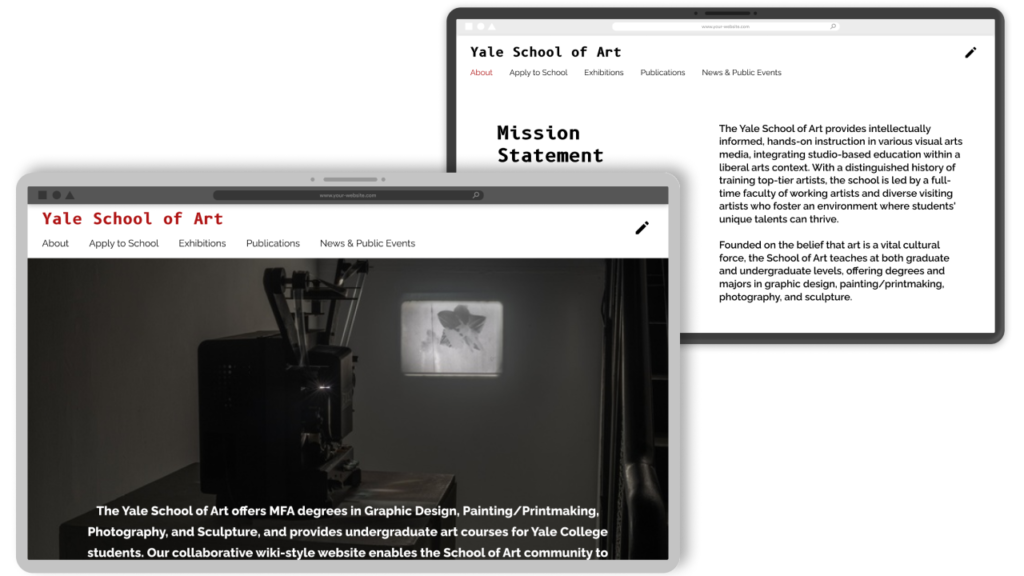
The Yale School of Art website is an ongoing collaborative experiment in digital publishing and information sharing. As a wiki, it allows all members on the School of Art community – graduate students, faculty, stuff, and alumni – to add new content. This is a fascinating concept that offers students a valuable opportunity to learn and experiment.
The Problem?
The experimental style impacts the site’s usability, navigation, and accessibility. This creates a frustrating experience, especially for users seeking practical information like prospective students.
Project Goals
Create a user friendly website that still have the essence of an experimental and artistic website.
- Improve the usability
- Improve the overall flow of the website
- Maintain the artistic, experimental nature of the website
- Use more of the students artwork for the website imagery and design
Original Website Analysis
Overview
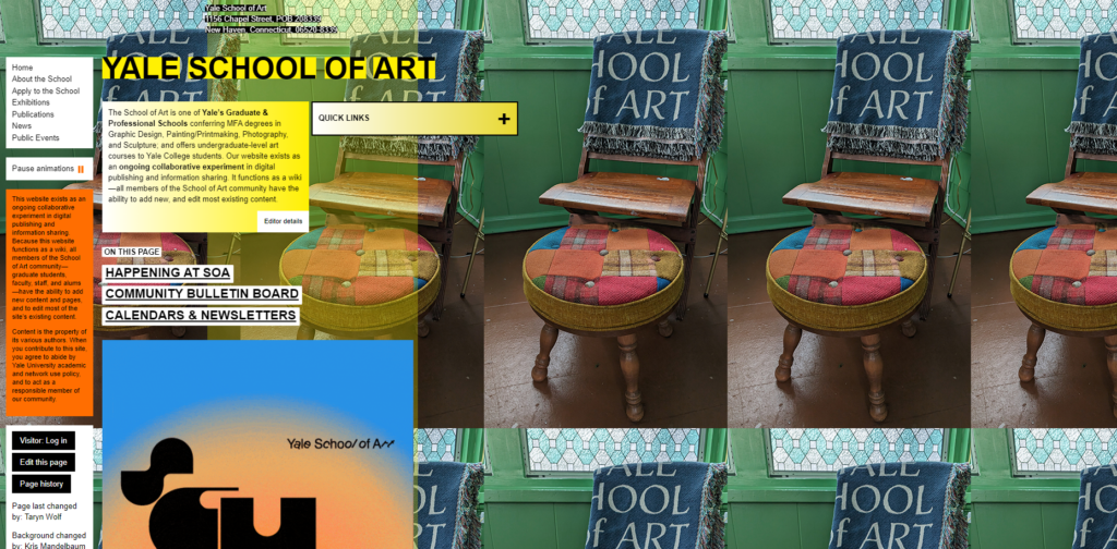
- Visual Overload
- Lack of Visual Hierarchy
- Inconsistent Typography
- Poor Navigation
- Overemphasis on style over Functionality
- Confusing Interactions
- Inconsistent Imagery
My Thoughts
By mixing unconventional and standard design patterns the website could still be experimental without hindering the users experience too much, since they will still be used to standard design patterns to help them navigate through the unconventional site.
My Thoughts
The web design seems to be influenced by the Brutalist web design movement – in its raggedness and lack of concern to look comfortable or easy, Brutalism can be seen as a reaction by younger generation to the lightness, and frivolity of today’s web design.
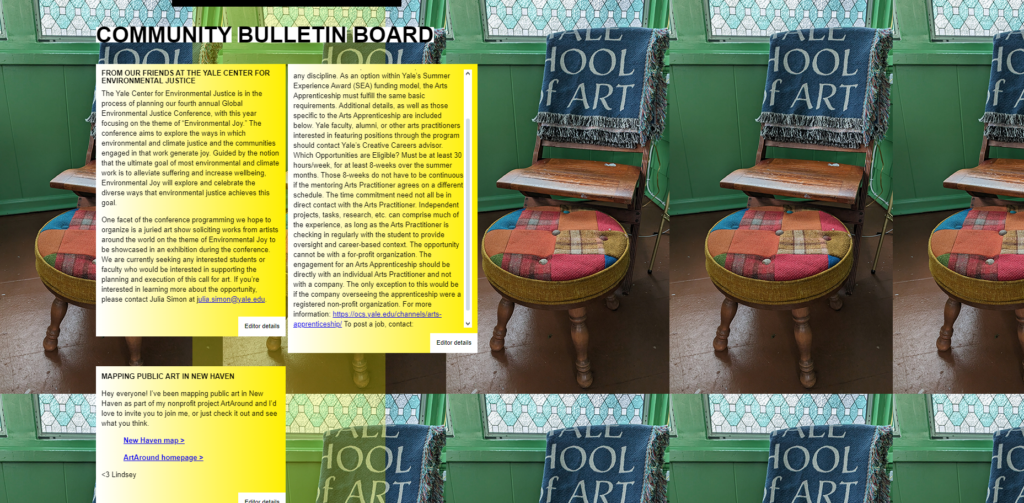
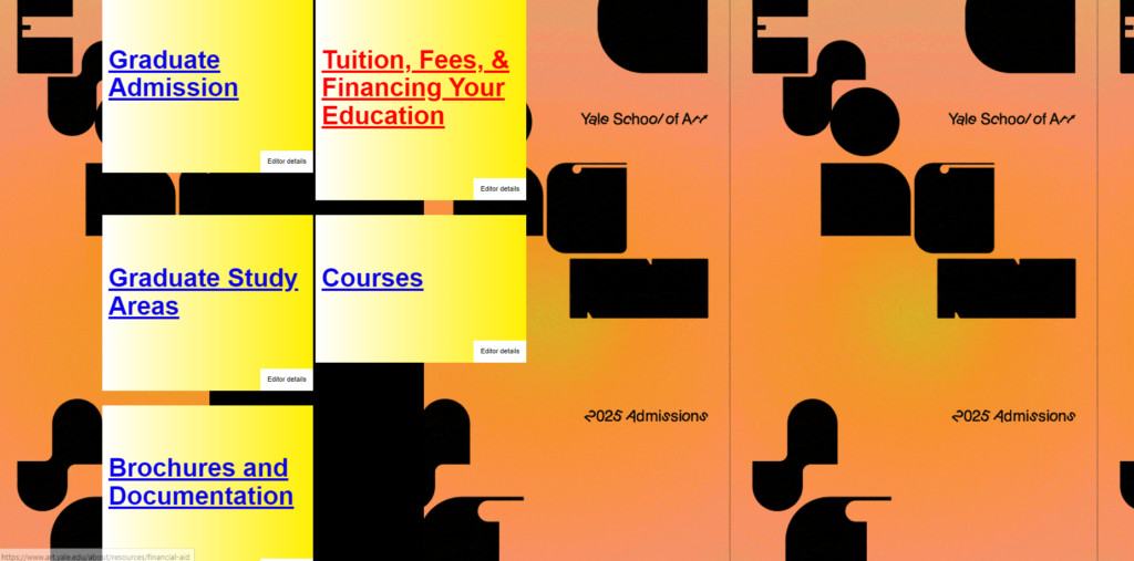
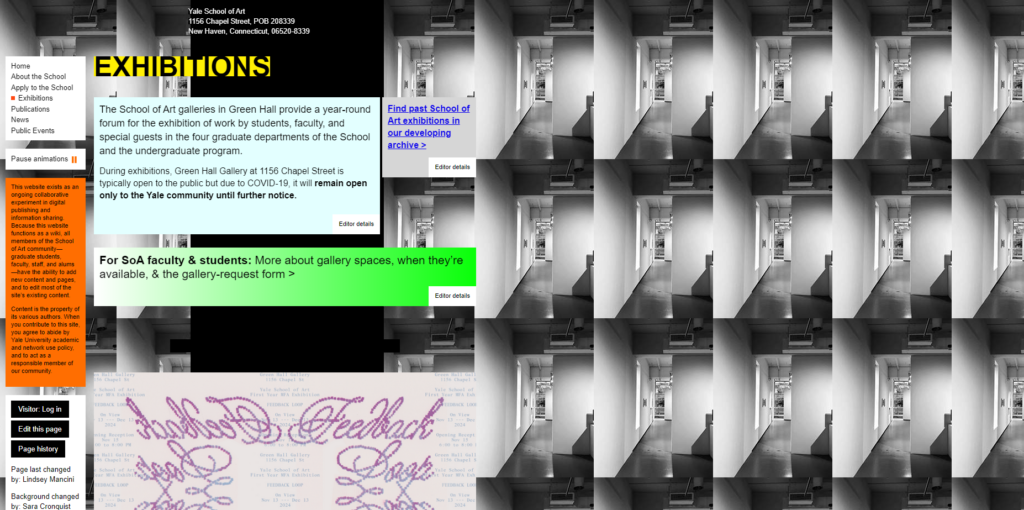
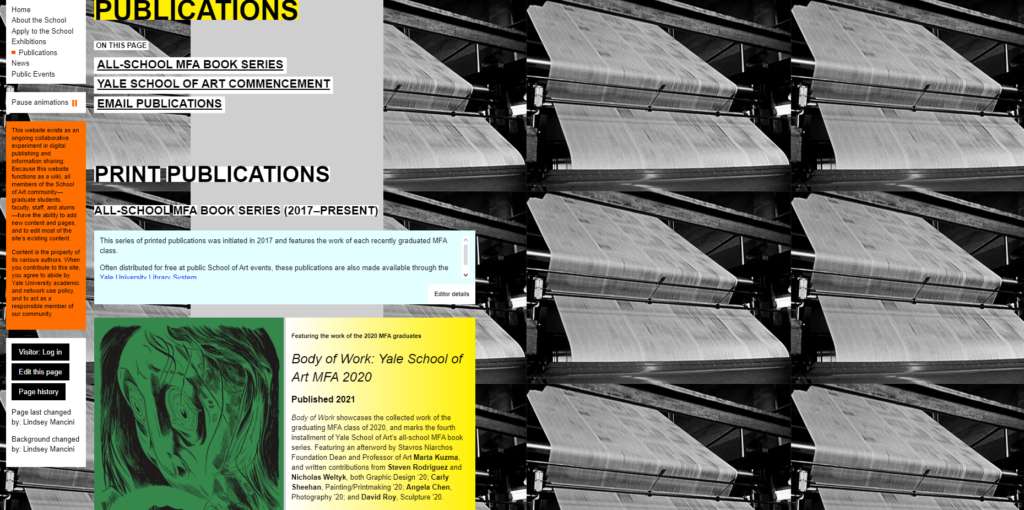
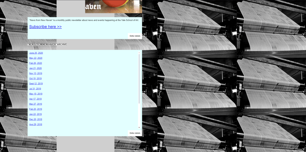
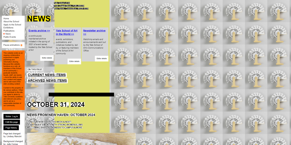
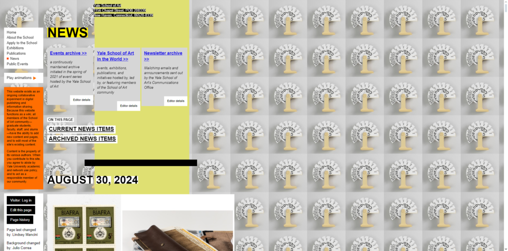
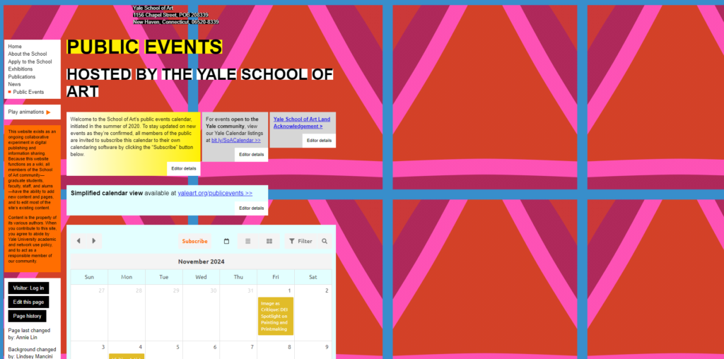
Visual Overload
- Cluttered, chaotic layout with excessive use of a variety of bright colours and animations (that only work on certain pages)
- Visually overwhelming and hard to focus on important content. The eye has no place to rest to start taking in the information on the page.
- Unstructured information.
- If the user is new to the website it will take them a while to work through all the information in order to fond what they are looking for – especially because the website doesn’t use any familiar design patters (e.g. top header with navigation tabs).
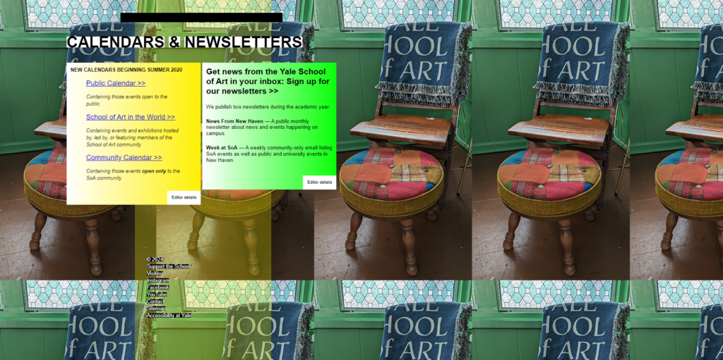
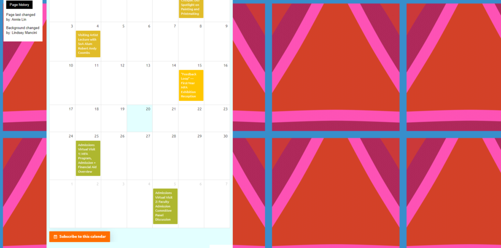
Lack of Visual Hierarchy
- No clear distinction between levels of information.
- Fonts, images, and text sizes are inconsistent and seem randomly placed.
- Text boxes also seam strangely small and compact, while the page on the right side is empty.
- Difficult for users to quickly identify what information is important.
- They can’t scan the page easily, which reduces the overall usability and readability of the site.
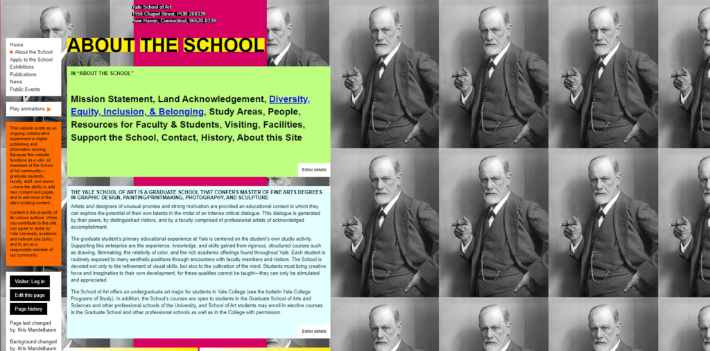
Inconsistent Typography
- The site uses various font styles, sizes, and colours that don’t follow a cohesive pattern. It lacks consistency across the board.
- Does not guide the user’s eye effectively.
- It can come across as unprofessional, especially for an academic institution (if the website was for current student only it would be a different case, but the website is used for future students to enroll).
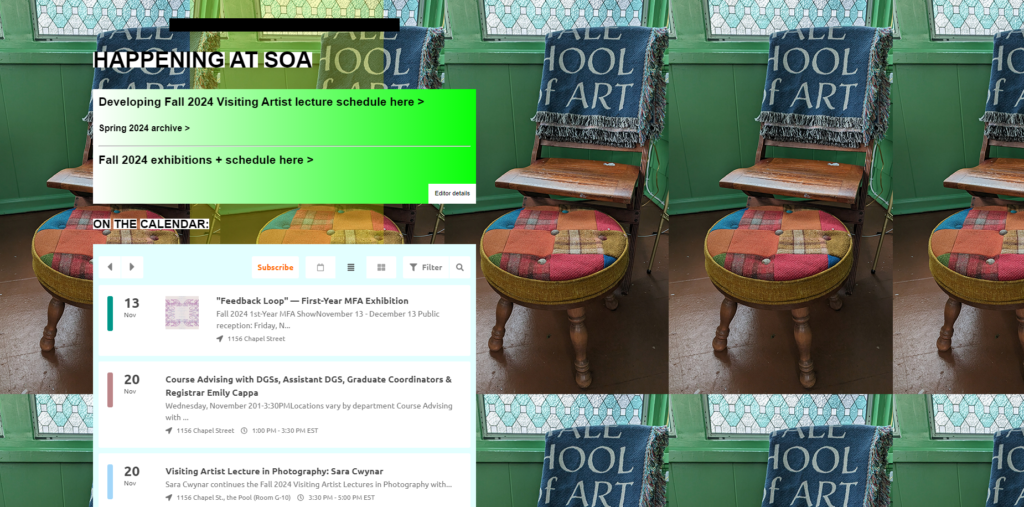
Poor Navigation
- The navigation is unconventional.
- Links are scattered across the page and is hard to identify (some are easy to identify while others are only identifiable once you hover over it).
- The menu doesn’t follow standard navigation patterns that users are accustomed to.
- It is hard to identify important sections like admissions, or course information.
- There are no strong, visible calls to action (CTA’s) guiding users to important next steps like applying, contacting the school, or exploring programs.
Overemphasis on Style Over Functionality
- The website seems more focused on being artistic and experimental, which is understandable for an art school, but it sacrifices ease of use and basic functionality.
- While creativity is a great asset for an art school, the website still needs to serve its primary function: providing useful information quickly and clearly.
- The over-the-top artistic approach hinders the user experience.
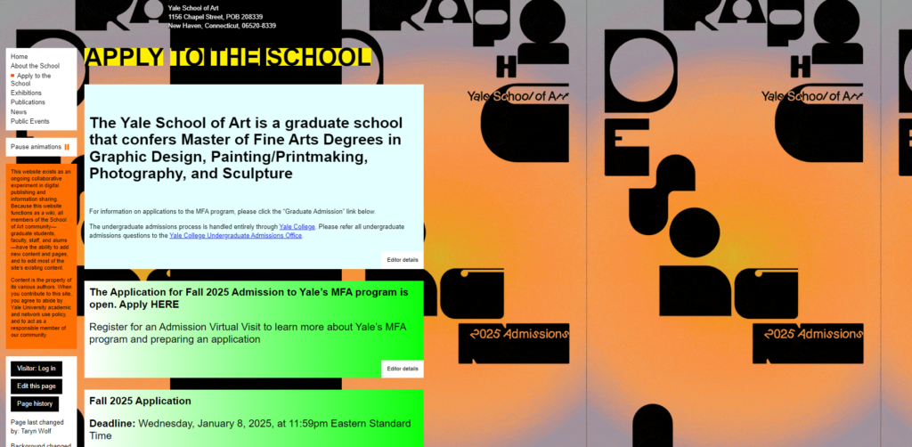
Confusing Interactions
- Some buttons, links, and interactive elements are not clearly marked or are difficult to recognize. (They don’t behave as expected, with unpredictable scrolling and navigation).
- Some buttons don’t seem to work at al on some pages.
- Users are left guessing how to interact with the site.
- It is easy to miss important links or get frustrated by the non-standard interaction, leading to a poor user experience.
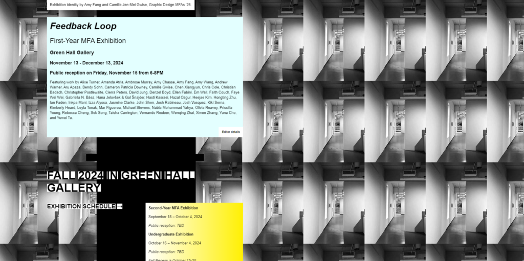
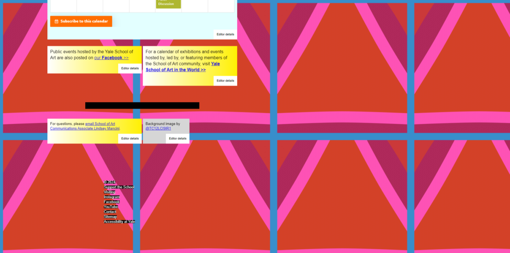
Inconsistent Imagery
- The images on the site vary widely in terms of quality, size, and relevance. Some seem randomly placed, while others are distracting rather than helpful.
- Poor imagery detracts from the credibility of the site and the message the school is trying to convey.
- Consistent, high-quality visuals would better represent the institution’s standards, as well as a better understanding of design and basic design elements and principles.
Research for Redesign
Overview
- Brutalist Web Design
- Websites that Inspired Me
- Key Brutalist Features
My Thoughts
The imagery used by Middle Plane is artistic and inspiring – I think that if Yale’s website incorporated similar imagery (perhaps from their own students) the website would serve as a source of inspiration for students as well as prospective students.
Brutalist Web Design
Brutalism in web design is about embracing minimalism, boldness, and function over form. This approach will align well with the creative spirit of the Yale website, while enhancing user experience.
To preserve the artistic and experimental spirit of the Yale School of Art website while embracing a brutalist design style, I can enhance the site to feel raw, functional, and boldly creative, while also making it more user-friendly.
Websites that Inspired Me
Middle Plane Magazine
Middle Plane Magazine is a contemporary art publication blending visual art, fashion, and culture. Each issue centers on a theme or artist, featuring diverse collaborations and exploring topics like nightlife, artistic inspiration, and iconic art figures. The magazine pushes boundaries with content spanning artist interviews, conceptual photo series, and innovative expressions.
Web Design
Middle Plane magazine’s website employs a Neo-Brutalist design style, which prioritizes raw aesthetics and functional simplicity. This approach diverges from conventional, polished web design by embracing a deliberately rough and unrefined look. The style features stark, minimalistic elements with an emphasis on bold typography, vibrant colours and structured layouts.
Brutalist design often avoids complex elements, focusing instead on content clarity. The layout consists of compartmentalized sections that guide the user’s eye and embrace navigability, with large, sans-serif fonts creating a visual impact. Colour schemes can be bold and high-contrast, using primary colours to draw attention. The style challenges the traditional norms of white space usage by minimizing padding or margins, leading to a densely packed visual experience. Its’s about functionality and directness over aesthetics, making it a unique choice for a publication that values visual storytelling and experimentation.
Key Brutalist Features
- Minimal Styling: Avoid excessive visual effects like gradients, shadows, or animations, favoring simple, flat designs.
- Bold Typography: Large, often unrefined fonts that dominate the visual hierarchy.
- Raw Aesthetic: Unpolished and functional, sometimes resembling early web design.
- Grid-Based Layouts: Strict, rigid grids that emphasize structure and order.
- Limited Color Palette: Often monochromatic or uses a small range of bold, stark colors.
- Intentional Imperfections: Exaggerated, asymmetrical layouts or elements designed to feel “unfinished.”
- Functional Approach: Prioritizes usability and straightforward navigation over visual appeal.
- Heavy Use of Text: Text content often takes precedence over images or other media.
- High Contrast: Bold contrasts between text and background for easy readability.
Redesign Planning
Overview
- Simplify Layout
- Bold Typography with Clear Hierarchy
- Minimal Navigation
- Experimental but Functional Interactions
- Intentional Use of Imagery & Colour
- Purposeful Asymmetry
Simplify Layout
The site is visually chaotic and overwhelming. To help reduce the visual overload I want the site to have a raw industrial feeling to help users easily navigate the content.
- Bold and unpolished layout
- Simplify structure
- Large blocks of monochromatic backgrounds (black, whites)
- Offset white background with bold colours of the students art
- Minimalist, grid-based layouts.
Bold Typography with Clear Hierarchy
Typography is inconsistent and chaotic, making it hard to navigate. To improve this and make all the information hidden in the site more easy and straightforward to get access to.
- Use bold, oversized typography, with a clearer hierarchy
- Stick to one or two brutalist-inspired fonts that feel raw and unconventional
- Ensure font and hierarchy stay consistent across the site
- Implement clear headers, sub-headers, body text sizes to guide the user’s eye naturally
Minimal Navigation
The navigation is unconventional, confusing and overwhelming. By having a focus on easy navigation users will have a better experience on the website and more easily find what they are looking for.
- Strip down the navigation to its essentials – just a few key categories, with no hidden or confusing menus
- The navigation bar should be easy to identify and clear
- No drop-downs, just direct links in a stark, oversized style
Experimental but Functional Interactions
Unpredictable interactions create confusion.
- Keep interactions raw but straightforward
- Make links very obvious – underline them, use hover effect that highlight the text in bold colours, or implement hard-edged buttons
- Use simple transitions like scrolling text or hard-cut page shifts that give a jarring yet functional feel
Intentional Use of Imagery & Colour
The imagery is inconsistent and distracting. To create a better flow on the website and make navigation more natural I will use bold accent colours and images of the students work.
- Use large, full-with images in specific areas
- Minimise image clutter elsewhere
- Stick to stark colour palette – black and white with poops pf one or two bold accent colours like red or orange
Purposeful Asymmetry
Layout is cluttered and lacks balance. This causes users to not know where to start reading or looking for information.
- Embrace asymmetry but with purpose
- Use oversized images and text blocks that break traditional layout rules but maintain enough negative space to prevent visual clutter
Mockups of Basic Web Design

Lorem ipsum dolor sit amet, consectetur adipiscing elit. Ut elit tellus, luctus nec ullamcorper mattis, pulvinar dapibus leo.
Lorem ipsum dolor sit amet, consectetur adipiscing elit. Ut elit tellus, luctus nec ullamcorper mattis, pulvinar dapibus leo.
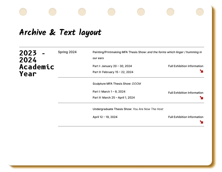
Lorem ipsum dolor sit amet, consectetur adipiscing elit. Ut elit tellus, luctus nec ullamcorper mattis, pulvinar dapibus leo.

Lorem ipsum dolor sit amet, consectetur adipiscing elit. Ut elit tellus, luctus nec ullamcorper mattis, pulvinar dapibus leo.
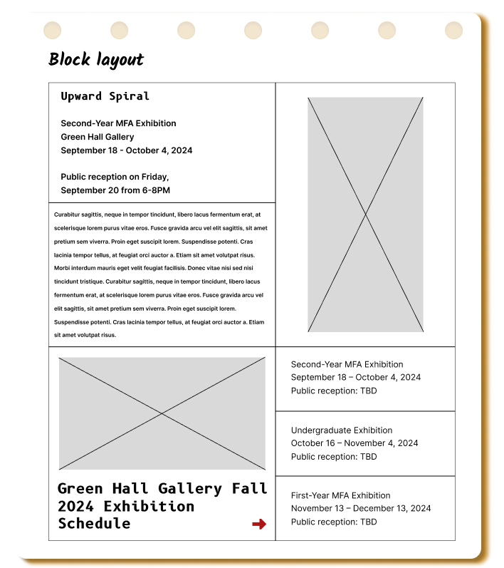
Lorem ipsum dolor sit amet, consectetur adipiscing elit. Ut elit tellus, luctus nec ullamcorper mattis, pulvinar dapibus leo.
Concluding Thoughts
Overview
- Simplify the Layout, Embrace Raw Structure
- Bold Typography with Clear Hierarchy
- Minimal Navigation
- Experimental but Functional Interactions
- Intentional Use of Imagery & Colour
- Purposeful Asymmetry
My Thoughts
The imagery used by Middle Plane is artistic and inspiring – I think that if Yale’s website incorporated similar imagery (perhaps from their own students) the website would serve as a source of inspiration for students as well as prospective students.
Simplify the Layout, Embrace Raw Structure
The site is visually chaotic and overwhelming.
- Keep he layout bold and unpolished, but simplify the structure.
- Use large blocks of monochromatic backgrounds (greys, whites) with minimalist, grid-based layouts.
This will give the site a raw industrial feel while helping users better navigate the content.
Bold Typography with Clear Hierarchy
Typography is inconsistent and chaotic, making it hard to navigate.
- Use bold, oversized typography but with a clearer hierarchy.
- Stick to one or two brutalist-inspired fonts that feel raw and unconventional.
- Ensure they are consistent across the site.
- Implement clear headers, sub-headers, body text sizes to guide the user’s eye naturally.
Minimal Navigation
The navigation is unconventional and confusing.
- Strip down the navigation to its essentials – just a few key categories, with no hidden or confusing menus.
- The navigation bar can be oversized or asymmetrical, adding to the brutalist aesthetic.
- No drop-downs, just direct links in a stark, oversized style.
Experimental but Functional Interactions
Unpredictable interactions create confusion.
- Keep interactions raw but straightforward.
- Make links very obvious – underline them, use hover effect that highlight the text in bold colours, or implement hard-edged buttons.
- Instead of confusing animations, use simple transitions like scrolling text or hard-cut page shifts that give a jarring yet functional feel.
Intentional Use of Imagery & Colour
The imagery is inconsistent and distracting.
- Use large, full-with images in specific areas (such as galleries or faculty profiles).
- Minimise image clutter elsewhere
- Stick to stark colour palette – black, white, and grey with poops pf one or two bold accent colours like red or orange. These elements should be used strategically to guide the user, rather than overwhelm them.
Purposeful Asymmetry
Layout is cluttered and lacks balance.
- Embrace asymmetry but with purpose.
- Use oversized images and text blocks that break traditional layout rules but maintain enough negative space to prevent visual clutter.