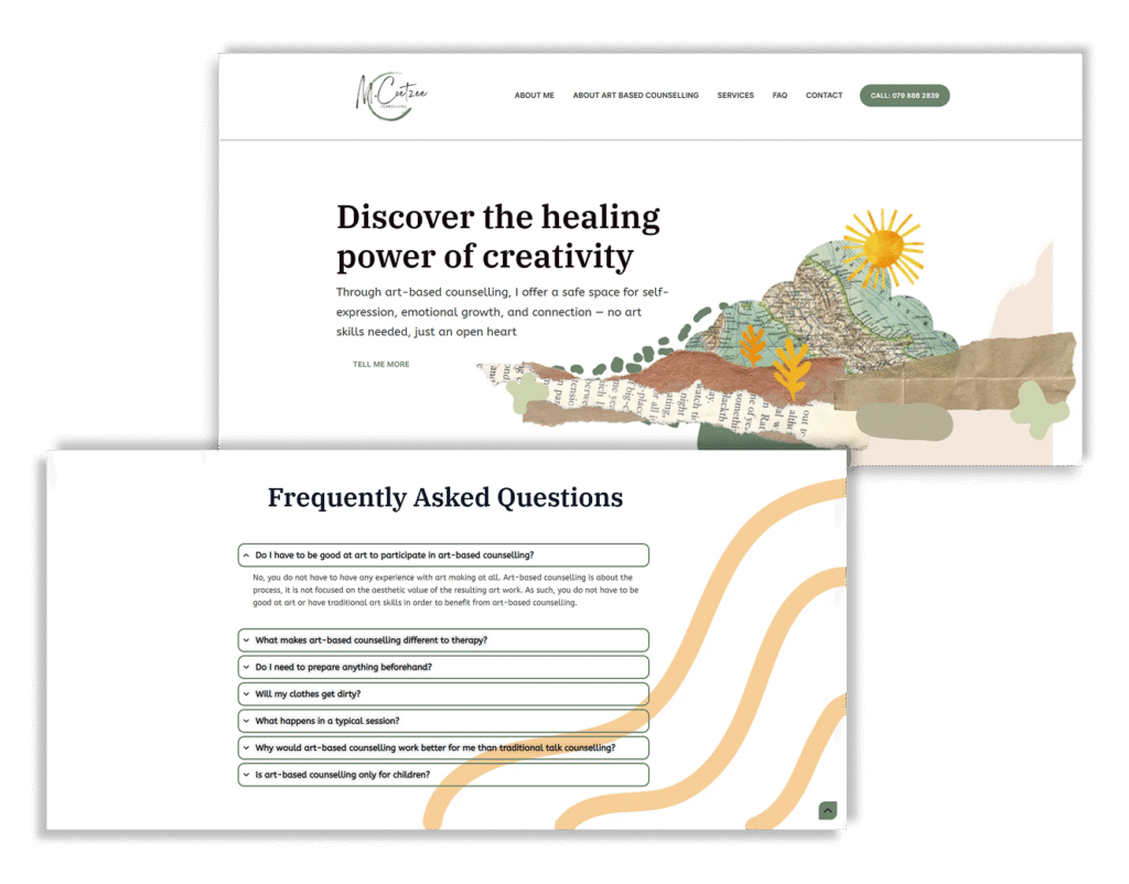
Discover the healing power of creativity
This project involved designing a website for an art-based counsellor, with a focus on creating a calm and supportive digital space. The goal was to ensure the site was easy to navigate, visually soothing, and accessible across all screen sizes. Clear information architecture, gentle visual design, and a streamlined booking process were key to helping visitors quickly find what they need and feel comfortable reaching out.
Project Overview
Role: UI/UX Designer, Web Designer
Tools Used: Hostinger, Elementor, Canva, Figma & Figjam
Timeline: 13 weeks
This is a freelance project for a client.
Background
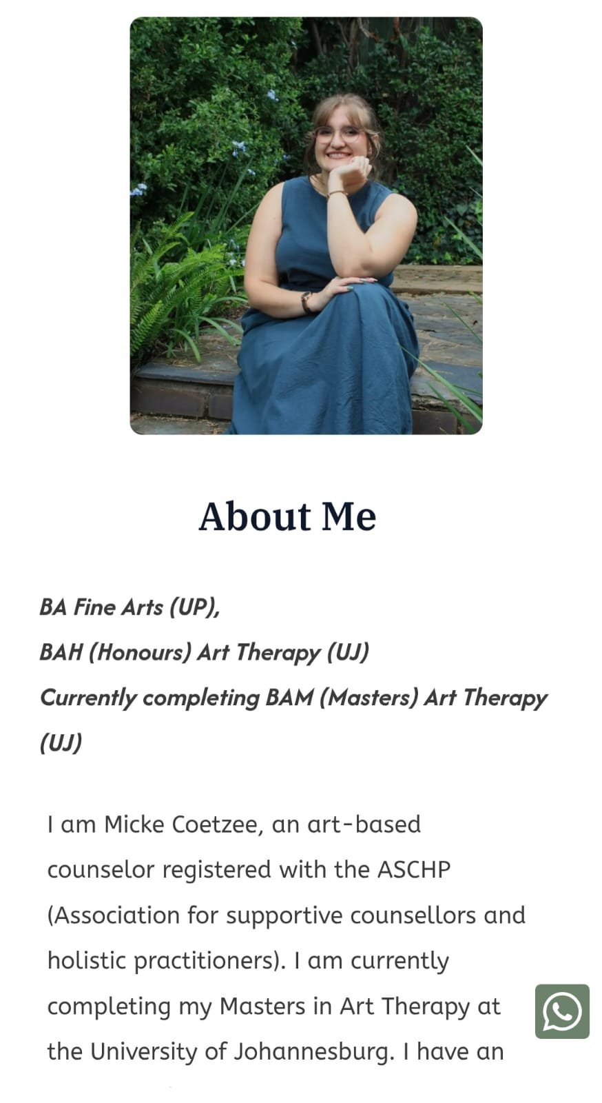
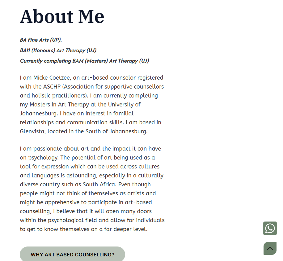
Client: An art-based counsellor based in Johannesburg, South Africa
Qualifications: BA Fine Arts (UP), Honours in Art Therapy (UJ), currently completing a Master’s in Art Therapy (UJ)
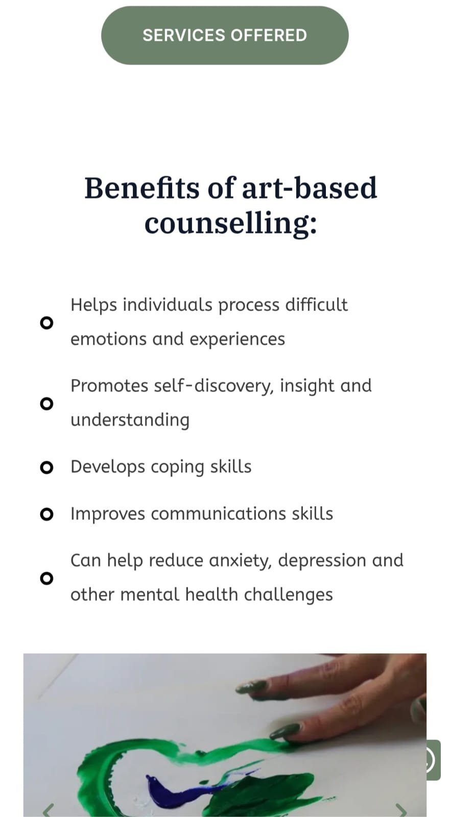
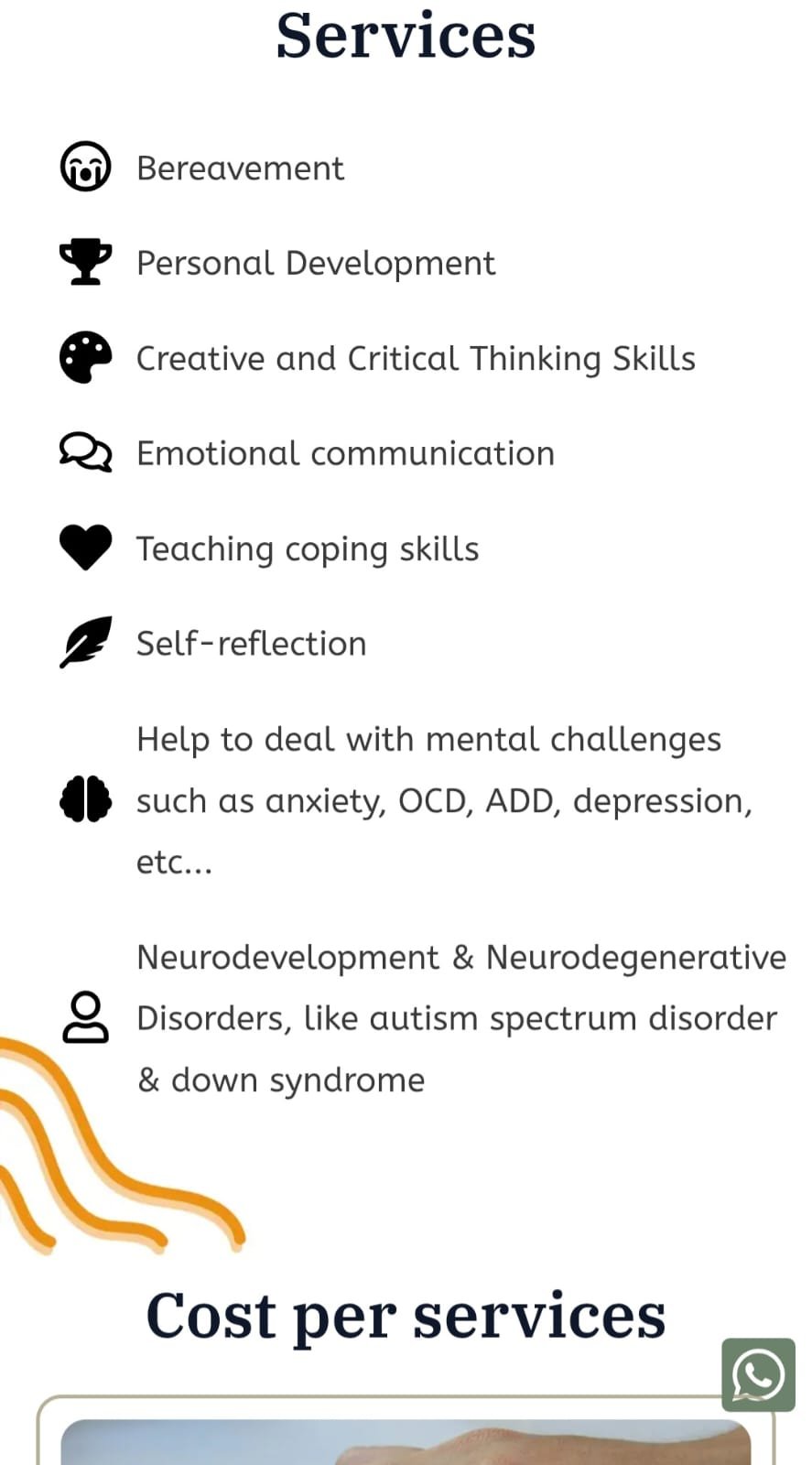
Focus Areas: Familial relationships, emotional communication, and self-discovery through art
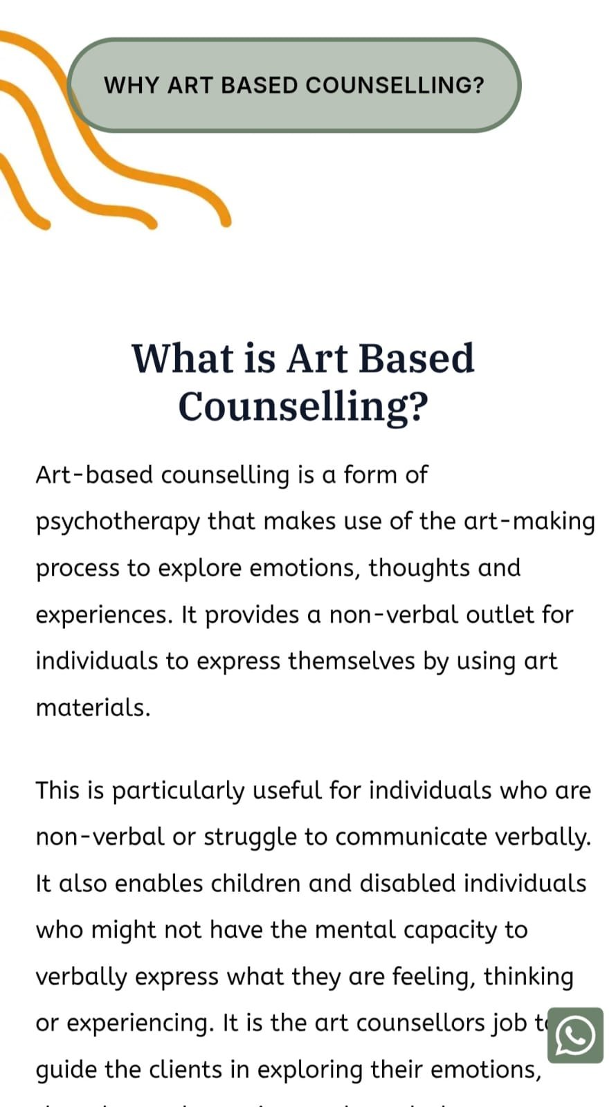
Therapeutic Approach: Uses art-based counselling to support clients of all ages, particularly those who struggle with verbal expression
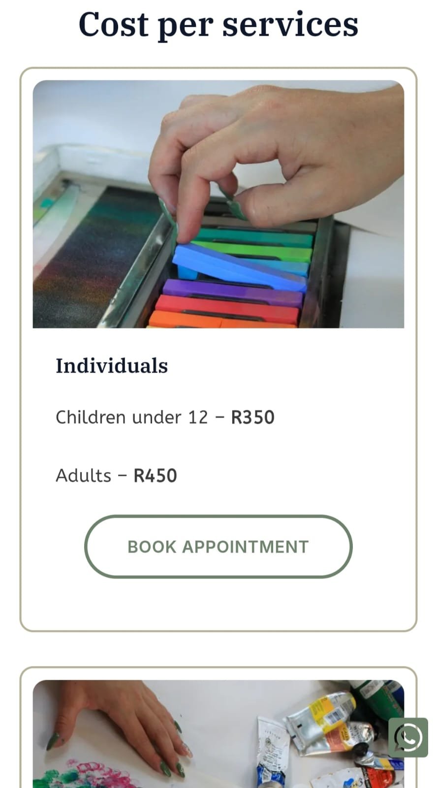
Project Goals
Create a calm, welcoming, and professional website
Clearly communicate Micke’s services and approach
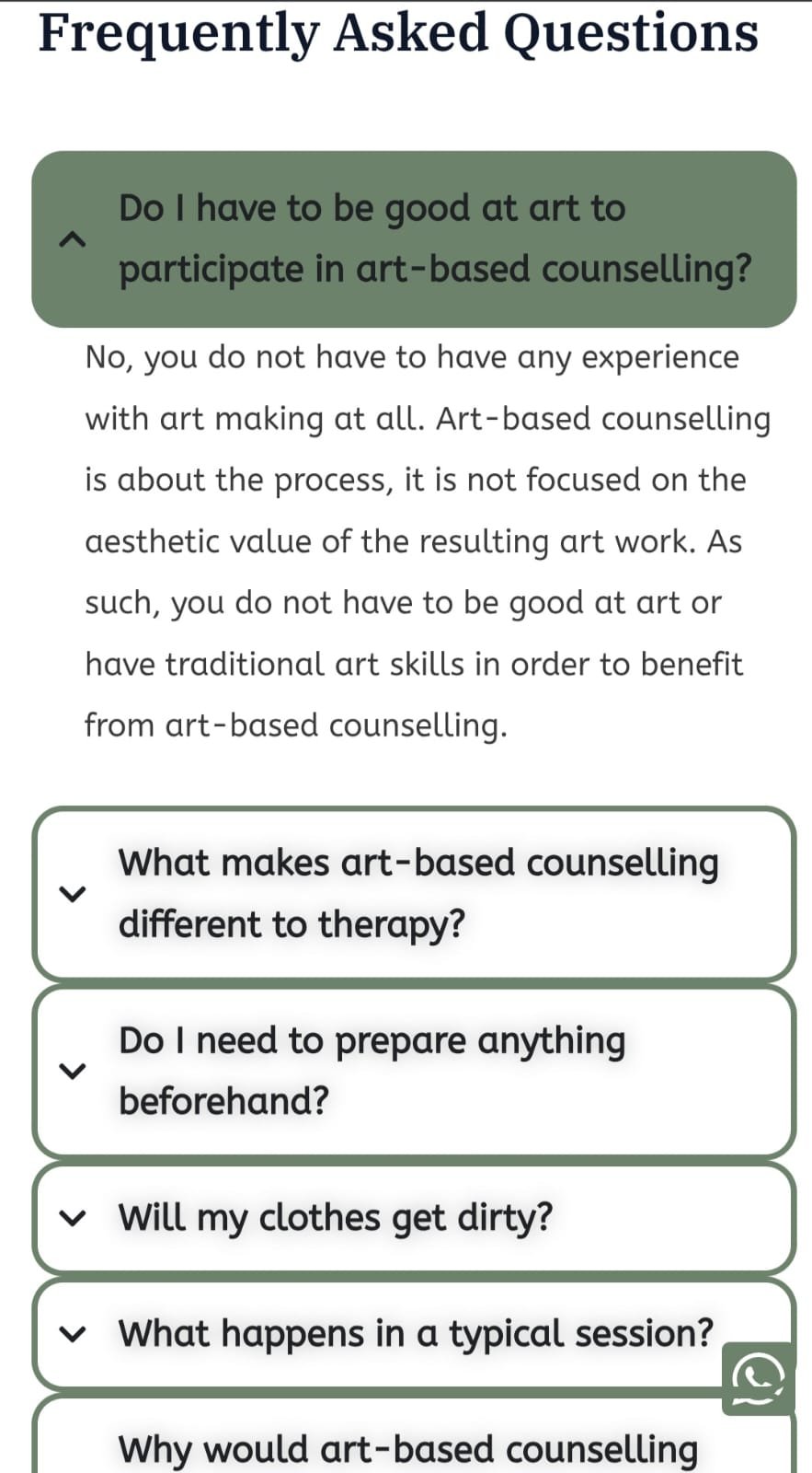
Make it easy for users to understand art-based counselling
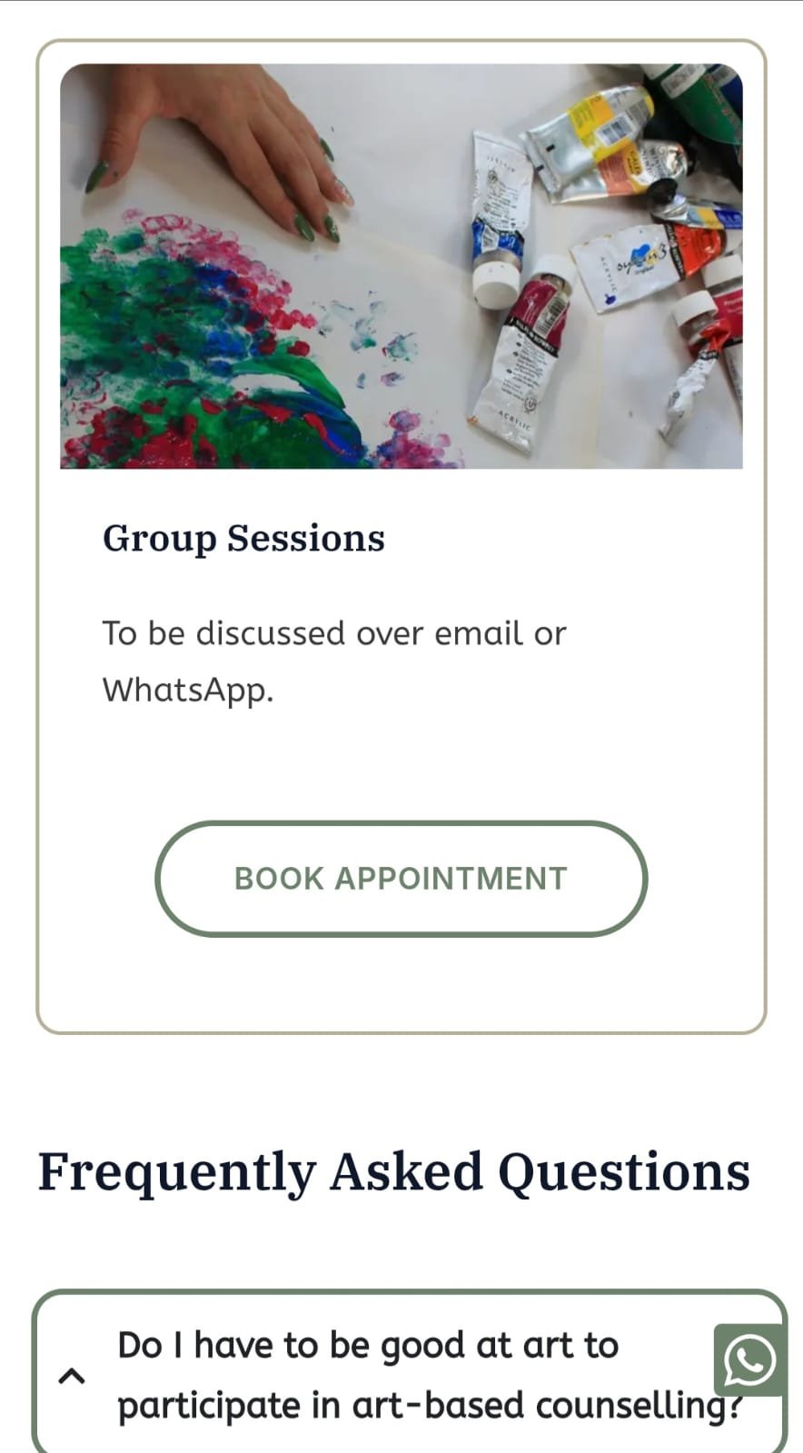
Ensure intuitive navigation and access to essential info (services, pricing, FAQ, location)
Streamline the process of booking appointments
Design responsively for all screen sizes (mobile, tablet, desktop)
Design Priorities
Simple, non-overwhelming layout
Soft, supportive visual language
Accessible and inclusive user experience
Consultation
Overview
- Online Meeting
My Thoughts
I believe most people use their phones to browse the web and look up information, so it was important to me that the website works seamlessly on mobile devices and feels just as intuitive and accessible on a small screen as it does on a desktop.
The project began with an in-depth conversation to understand the clients vision for her practice and how the website could support her goals. We discussed the core purpose of the site—to inform, reassure, and guide users toward booking a session.
During this phase, I focused on:
Understanding the Practice: I asked about the clients background in art therapy, her counselling approach, and the unique value she offers as an art-based counsellor.
Clarifying the Audience: We talked about the people she works with—often individuals in vulnerable emotional states—and how the site should feel approachable, safe, and inclusive to them.
Identifying Key Features: The client wanted the website to highlight what art-based counselling is, how it works, what to expect in a session, and how to get in touch. A smooth booking process was a top priority.
Defining the Look and Feel: We discussed the tone of the site—gentle, calming, and professional. The visual design needed to reflect the therapeutic nature of the work without overwhelming the visitor.
Technical Needs: We outlined what functionality was needed (e.g. contact forms, WhatsApp/email links, responsive design) and talked about platforms and technical constraints.
Research
Overview
- Understanding the Field
- Audience Insights
- Industry Standards
- Content Strategy Planning
- Visual Direction
My Thoughts
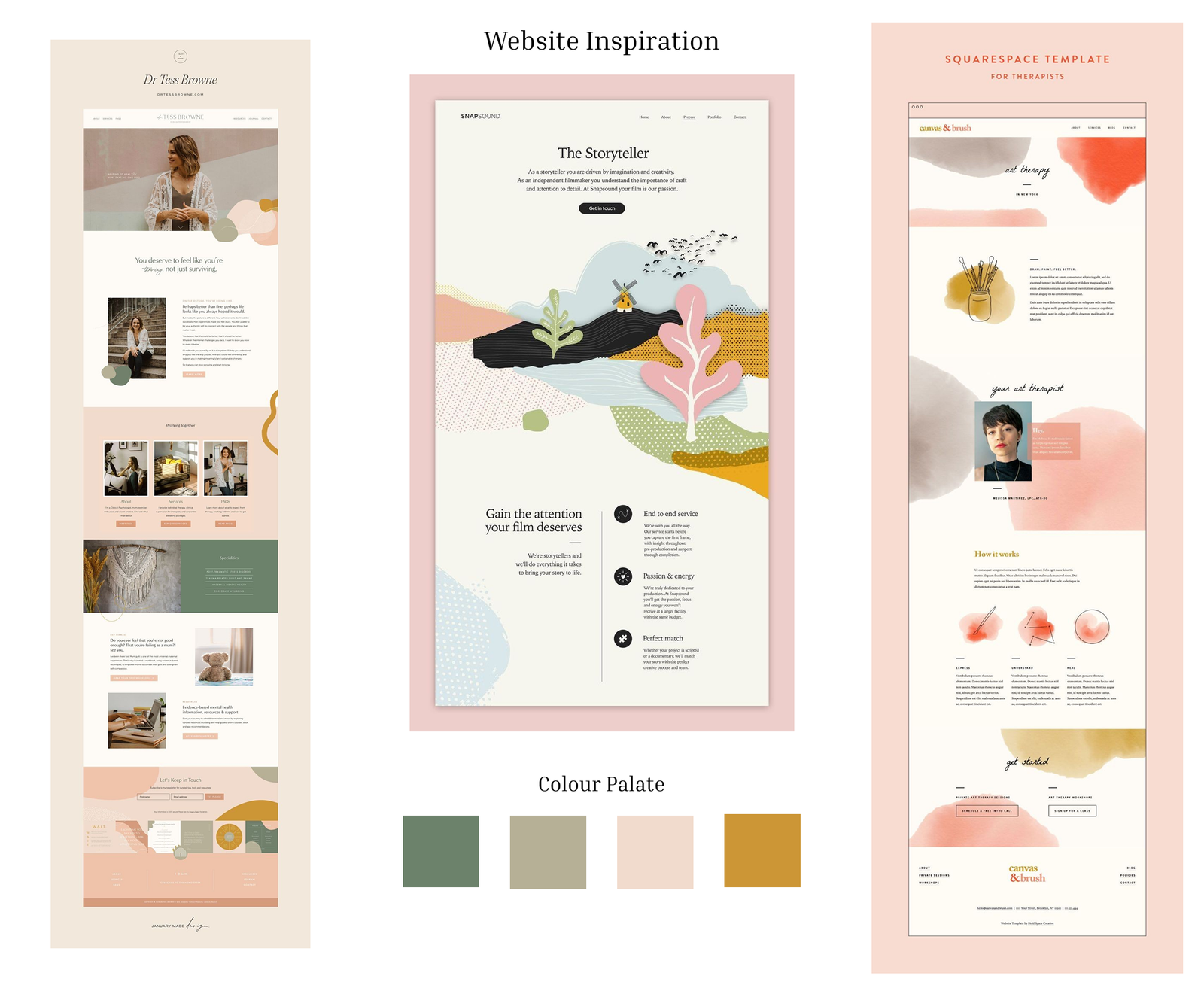
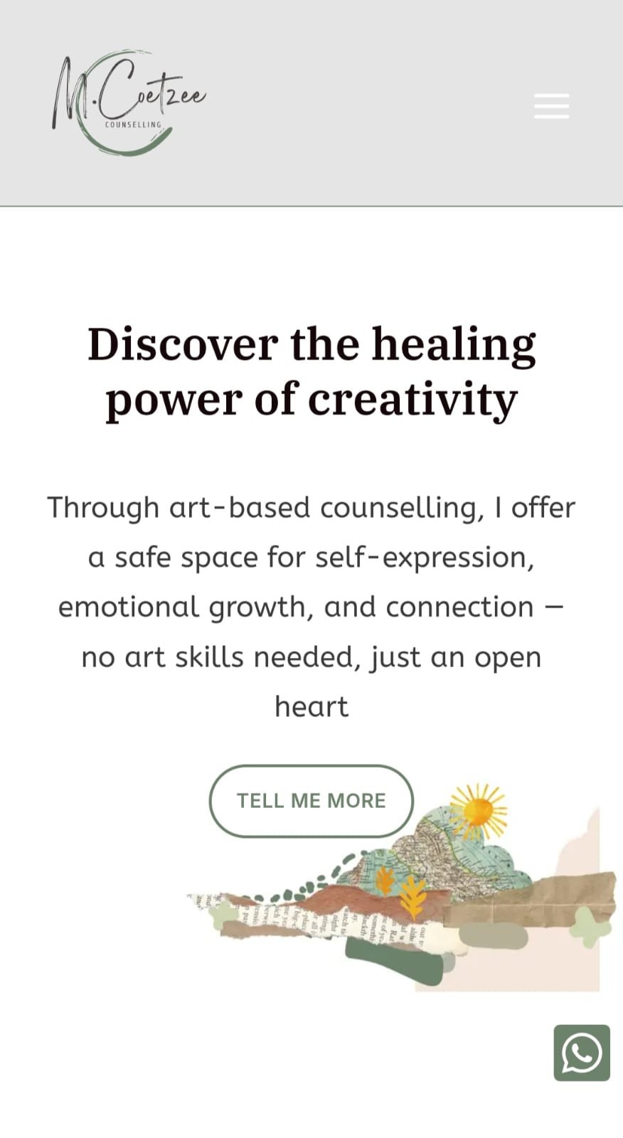
For the visual design, my goal was to make the site clearly reflect that it offers art-based counselling, not just general counselling. I focused on integrating creative, artistic touches—like soft textures, collage, and organic shapes—to subtly evoke the feeling of art-making without overwhelming the user. At the same time, I made sure the overall tone remained calming and grounded, aligning with the therapeutic nature of the service. Thoughtful use of whitespace, a gentle color palette, and intuitive layout helped guide users smoothly through the site, making it easy to explore, understand the offerings, and take action with confidence.
To design a website that truly reflected the clients values and met the needs of her clients, I began with a focused research phase.
Understanding the Field: I familiarized myself with art-based counselling—how it works, who it helps, and how it differs from traditional therapy. This helped me design a site that could explain the practice clearly to first-time visitors.
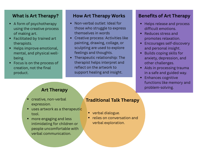
Audience Insights: I considered the emotional state and possible hesitations of potential clients—especially those who may feel anxious about therapy or unsure about art-making. This informed choices around tone, language, and layout, aiming for a design that felt safe, calming, and inclusive.
Industry Standards: I explored websites from other therapists and wellness professionals to identify what works well—clean navigation, reassuring visuals, and clear information paths—and noted areas to improve, such as overly clinical tones or cluttered layouts.
Content Strategy Planning: I worked with the client to identify key information people would need to see quickly—what art-based counselling is, how it helps, how much it costs, and how to get in touch. We prioritized simplicity, breaking the content into digestible sections.
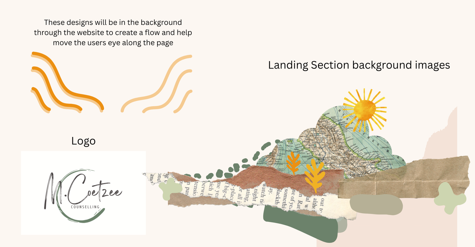
Visual Direction: I began gathering references and moodboards to define a gentle, grounded visual style that reflects Micke’s approach—one that avoids overwhelming visuals, uses soft colors, and supports a feeling of calm.
Site Planning
Overview
- Sitemap Creation
- Content Hierarchy & Clarity
- Focused User Pathways
- Balance of Information & Calm Design
- Interactive Refinement
My Thoughts
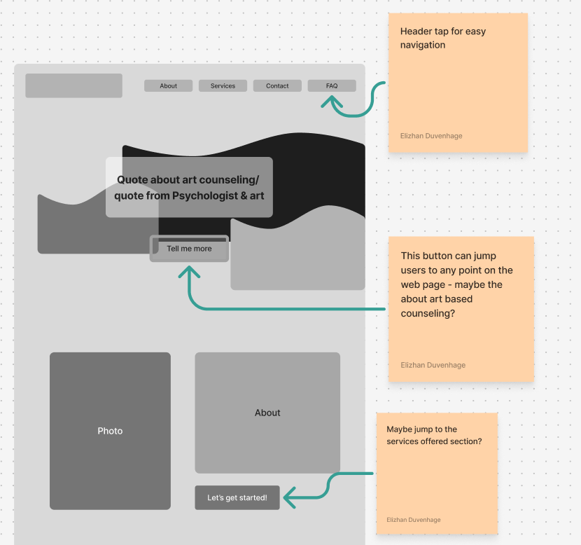
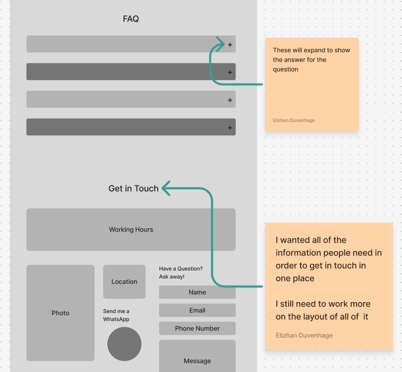
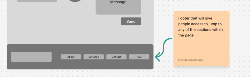
To make the user journey smoother and more intuitive, I strategically placed buttons throughout the page to guide visitors to key sections—such as services, FAQs, and booking. These internal links help users quickly access important information without excessive scrolling, creating a more seamless and user-friendly browsing experience.
Sitemap Creation:
I began by developing a clear sitemap to organize the website’s main sections: Home, About, Services, FAQ, and Contact/Booking. This ensured a logical flow for visitors to navigate the site without feeling lost or overwhelmed.I chose a single-page layout to reduce the potential for users to feel overwhelmed. By placing all the essential information on one scrollable page, users can access everything they need in one place without the friction of navigating between multiple pages. This approach supports a calmer, more focused browsing experience, especially on mobile devices.
Content Hierarchy & Clarity:
I structured each section with the user’s attention span and reading habits in mind. Content was broken into concise, skimmable sections with clear headings and supportive subheadings.This approach reduces cognitive load and makes it easier for users to find what they need without wading through dense text.
Focused User Pathways:
I prioritized essential user actions—like understanding what art-based counselling is, viewing services, and booking a session. These elements were made prominent using buttons, minimal scrolling, and mobile-friendly layouts to guide users toward their next step.Balance of Information & Calm Design:
Since the site represents a therapeutic service, I made sure that the information architecture and content delivery felt calming rather than clinical. Language was kept warm and reassuring, while also being informative.Iterative Refinement:
Throughout the planning process, I worked closely with the client to ensure the structure reflected their values and tone. Content placement was refined based on feedback to highlight services and answer common questions in a non-intimidating way.
Wireframing & Design
Overview
- Low-Fidelity Wireframe
- User-Centered Layout
- Design for Emotion
- Responsive Design Considerations
My Thoughts
To give the landing page a more creative and expressive feel, I designed a custom collage-inspired image. This artwork added a unique, personal touch while reinforcing the artistic nature of the counselling practice. It also introduced subtle textures to the page, helping to break up clean sections with visual interest and warmth—without overwhelming the overall calming aesthetic.
Low-Fidelity Wireframes:
I began the design process by sketching low-fidelity wireframes to establish the basic layout, content hierarchy, and user flow. This helped me focus on structure first—making sure that key information like services, FAQs, and booking options were clearly accessible without visual distractions.
User-Centered Layout:
The wireframes were designed with user behavior in mind, especially on mobile devices where space is limited. I prioritized scrollable sections, anchored navigation, and clear visual cues to help guide the user through the content in a natural, stress-free way.Design for Emotion:
I wanted the site to feel both creative and therapeutic, so I balanced artistic textures and shapes with a sense of openness and calm. The design avoids clutter, allowing space for each section to breathe and reducing cognitive overload.
- Responsive Design Considerations:
Every step of the wireframing and design process factored in responsiveness. I designed mobile-first, ensuring that the layout would scale fluidly across screen sizes and that buttons, text, and forms remained easy to interact with on touch devices.
Development
Overview
- Responsive Design
- Smooth Scrolling
- Performance Optimization
- Accessibility
I focused on translating the visual mockups into a fully functional, responsive website. I built the site using WordPress which I accessed through Hostinger and I used the website builder Elementor, ensuring that every element—from layout and typography to buttons and interactive features—matched the original design intention.
Key development considerations:
Responsive Design:
I developed the website with a mobile-first approach, optimizing every section to scale smoothly across different screen sizes, by using “flexboxes”. This was especially important given the target audience’s likelihood of browsing on phones or tablets. Layouts, images, and buttons were all adjusted for optimal readability and ease of use on smaller screens.
Smooth Scrolling Navigation:
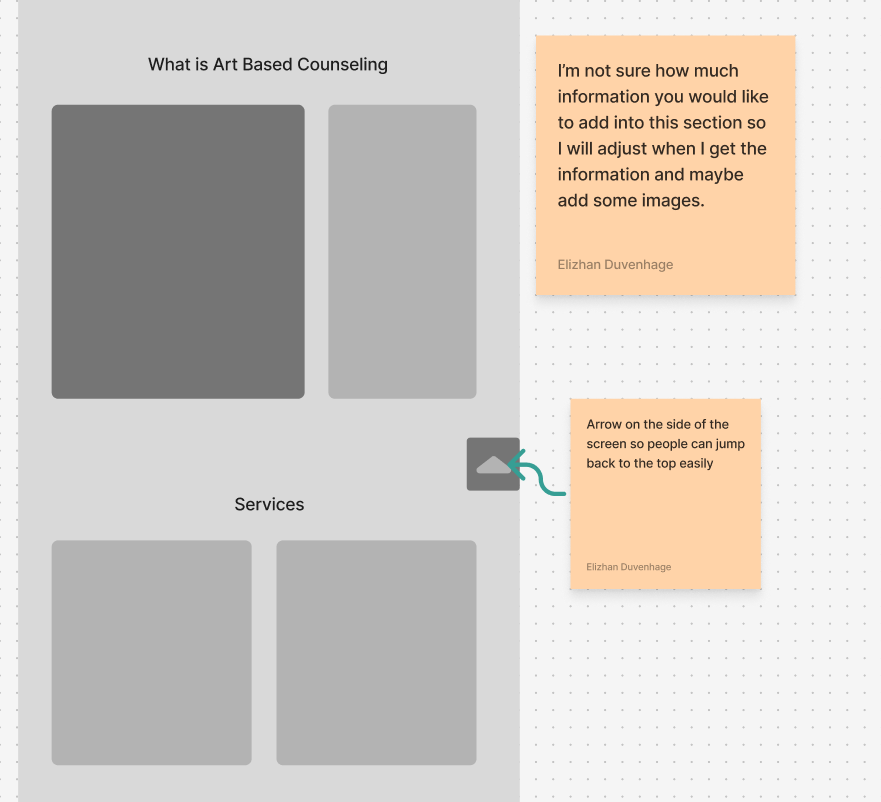
To support the single-page layout, I implemented smooth scroll functionality and anchored buttons, allowing users to jump to specific sections—like Services or Booking—without feeling lost on the page.- To enhance usability and encourage action, I added sticky buttons on the right-hand side of the screen. One allows users to scroll back to the top of the page effortlessly, improving navigation on longer mobile screens. The other links directly to the client’s WhatsApp, providing a convenient way for potential clients to ask questions or book a session with just one tap—removing barriers and supporting quicker engagement.
Performance Optimization:
I compressed images, streamlined code, and limited the number of external resources to keep load times fast and the user experience seamless. This was essential for retaining visitors, especially on mobile devices with limited bandwidth.Accessibility:
I followed best practices for accessibility by ensuring high color contrast, using alt text for images, and making sure the site could be navigated easily by keyboard or screen readers.
Testing & Launching
Overview
- Cross-Device & Cross-Browser Testing
- User Flow Testing
- Functionality Checks
- Client Walkthrough & Feedback
Once the initial development phase was complete, I moved into a thorough testing and refinement stage to ensure the site was functional, intuitive, and polished across all devices and browsers.
Cross-Device & Cross-Browser Testing:
I tested the website on a range of devices—including smartphones, tablets, and desktop computers—as well as across major browsers (Chrome, Safari, Firefox, Edge) to ensure visual consistency, proper responsiveness, and smooth user interaction. This helped identify and resolve any layout shifts, text clipping, or interaction issues that could affect usability.User Flow Testing:
I walked through each user flow as if I were a first-time visitor:
Can I quickly understand what the service is about?
Is it obvious how to book or contact the practitioner?
Do the sticky buttons enhance navigation or get in the way?
By stepping into the user’s shoes and refining weak spots in the journey, I made small but impactful adjustments to wording, spacing, and button placement to streamline the experience.
Functionality Checks:
I tested every interactive element, including:
Anchor links and smooth scrolling
WhatsApp integration
Contact forms
Sticky navigation buttons
All were verified for functionality, speed, and error-free performance on both mobile and desktop.
- Client Walkthrough & Feedback:
I also conducted a final walkthrough with the client, guiding them through the completed site. This gave them a chance to test it for themselves and raise any final thoughts or questions. - Their feedback helped catch a few last tweaks—such as rewording a heading or adding clarity to button labels—before launch.
- Local SEO & Google Business Setup:
To help the client reach more people in her area and increase her visibility online, I created and set up a Google Business Profile for her counselling practice. This included:
Registering the business on Google Maps, so it appears in local search results when people look for counselling services in the Glenvista or Johannesburg South area.
Adding essential details like her name, address, contact number, website link, service hours, and service categories to ensure accuracy and trust.
Uploading profile and cover images that reflected the calming, artistic nature of her practice to help establish visual consistency with the website.
Including a detailed business description to clearly explain what art-based counselling is and who it’s for—helping her stand out from traditional talk-based therapy listings.
Connecting her website link to the listing so that interested users can easily click through and learn more or book a session.
This step was crucial in supporting local SEO and helping potential clients discover her practice through Google Search and Maps, especially on mobile devices.